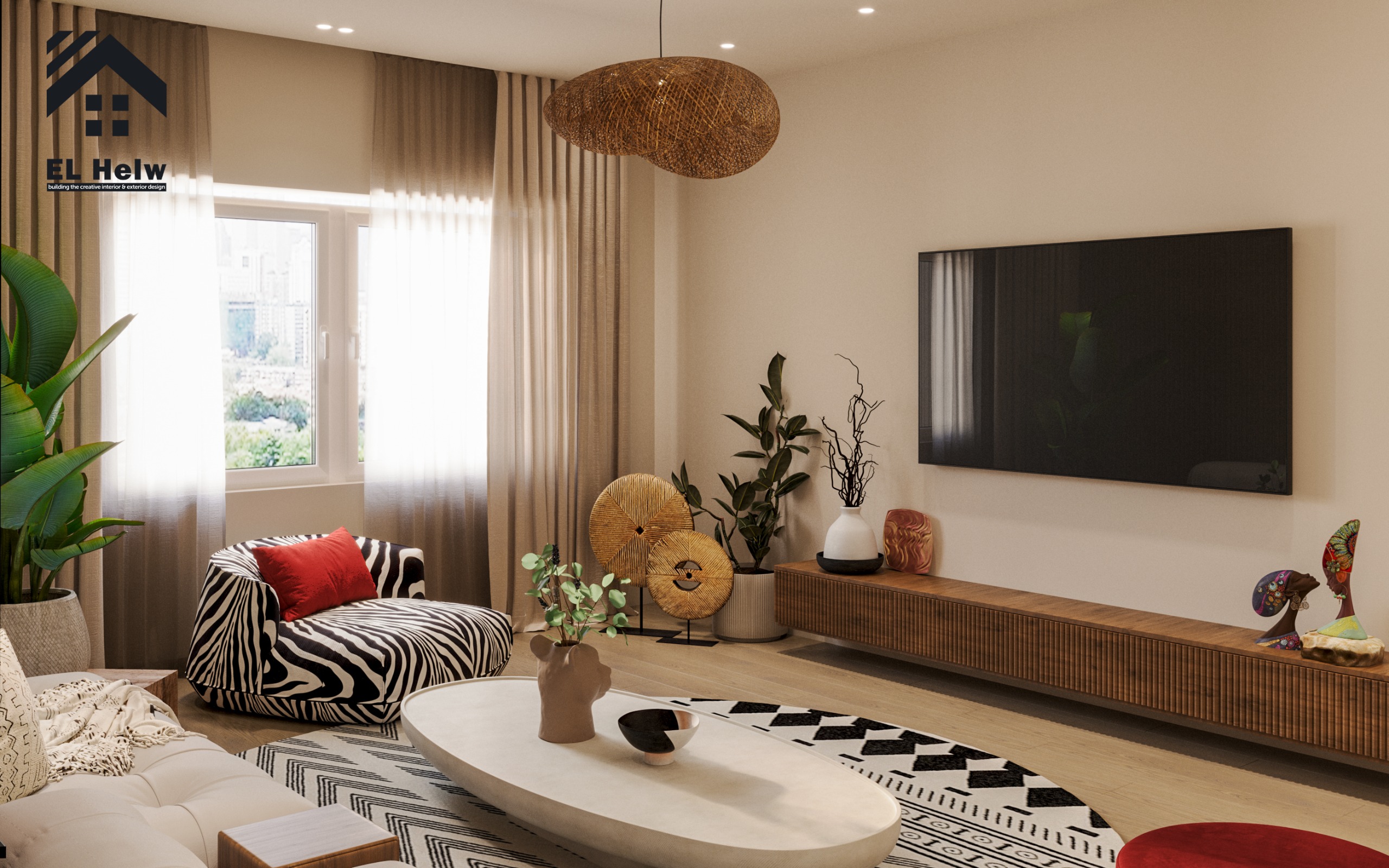
The Importance of Color Planning in Luxury Mansions and Villas
When we set out to design and plan luxury villas and mansions, we fully realize that interior villa colors are not just passing aesthetic choices made in the final meters of finishing. Instead, they are fundamental architectural and engineering decisions that affect the resident's psychological comfort, enhance space efficiency, and interact harmoniously with natural lighting and architectural masses.
Drawing from our over 18 years of experience in executing luxury villas and mansions across the Egyptian and Gulf markets, we emphasize that the ideal color scheme begins with a precise understanding of sun paths, wind directions, and the nature of each space inside the villa to ensure a comprehensive architectural design.
The Engineering Foundation for Choosing Interior Colors in Luxury Villas
We never choose colors in isolation from other elements of architectural and executive design. Before determining a single color shade for reception walls or bedrooms, we carefully study the sun's path from sunrise to sunset for each architectural facade:
-
Eastern Spaces: Rooms facing east receive a cool, refreshing morning light. Here, we make sure to employ warm tones to balance this natural brightness.
-
Western Spaces: Conversely, living spaces facing west are exposed to intense afternoon sunlight. Therefore, we adopt calm color schemes for them that absorb the severe heat and give the eye a sense of spaciousness and tranquility.
Architectural Note: We also account for the distribution of wet and service spaces. Even if colors are bright and cheerful, poor ventilation or the proximity of bathrooms and kitchens to reception areas negatively impacts the overall feel of the place. Therefore, we place bathrooms and kitchens in a carefully studied corner of the floor plan with opposing ventilation openings (Cross Ventilation) to ensure air purity and steady visual lighting inside the villa.
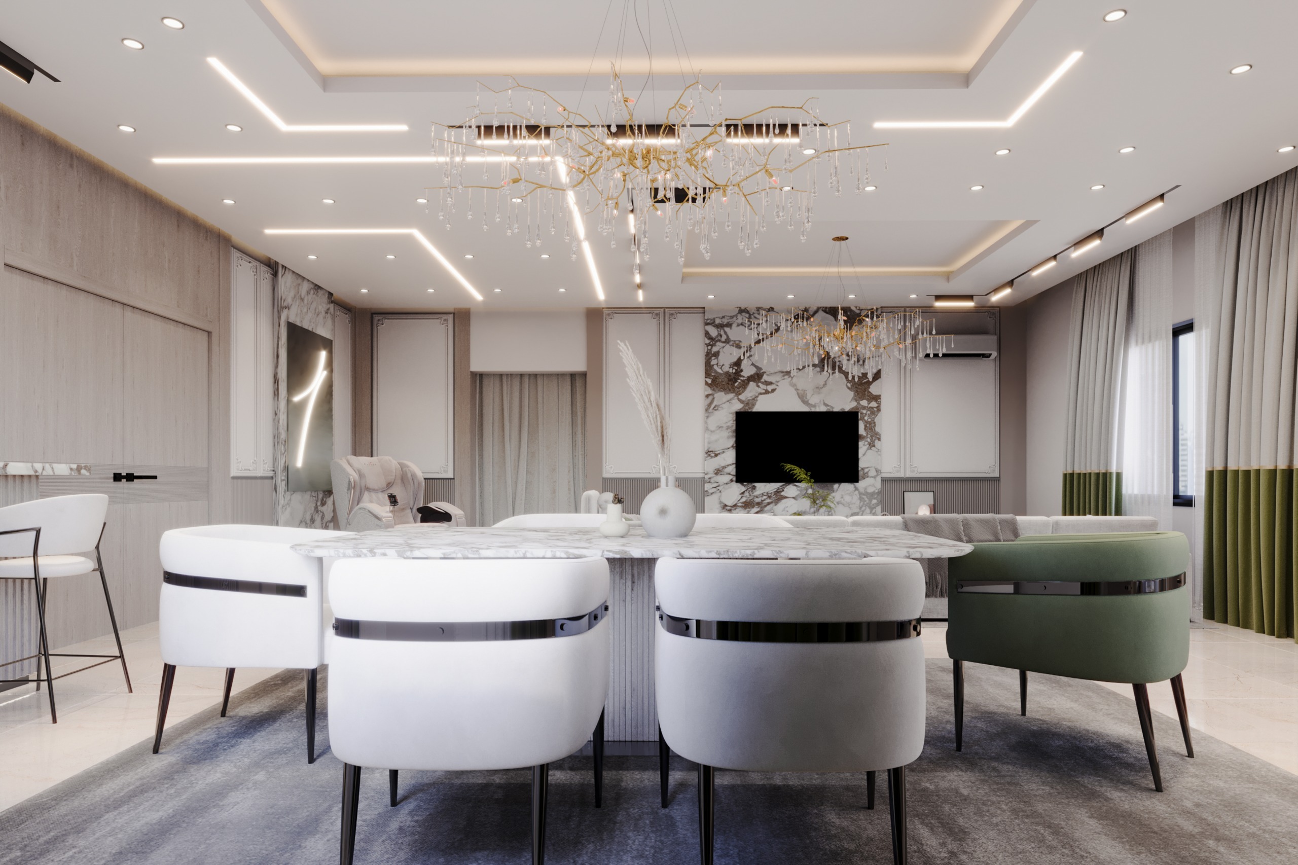
An engineering floor plan illustrating the orientation of interior villa spaces, natural lighting paths, and wind directions by Al-Helou Designs.
How Do We Build the Color Scheme for Major Spaces (Reception & Living)?
Reception and "reception" spaces in luxury mansions and villas require a visual personality that reflects luxury without clutter. We rely on the famous 60-30-10 rule for color distribution, but through our own engineering vision:
-
60% for the Base Color: A calm, balanced tone on the main walls (such as soft beige, warm grey, or architectural off-white).
-
30% for the Secondary Color: Appears in furniture, wooden flooring, or marble.
-
10% for the Accent Color: Dedicated to accessories, artworks, and prominent lighting.
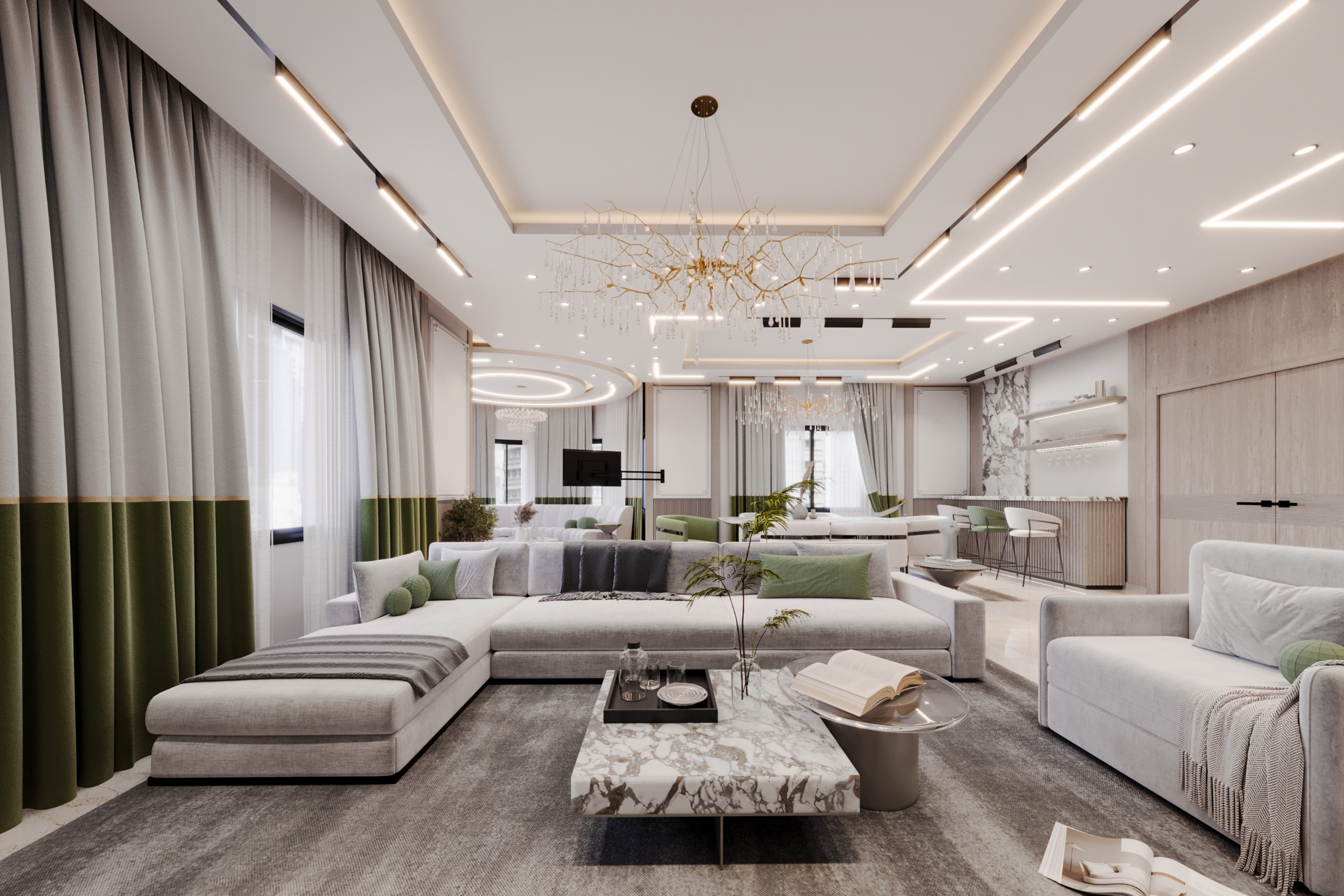
These deep, neutral shades form an ideal canvas that flexibly interacts with hidden lighting and crystal chandeliers, imparting a sense of spaciousness and breadth through the studied blend of natural materials like marble and wood with luxurious earthy color gradients. For more details on execution phases, you can check out our article on Luxury Villa Design, Execution, and Handover Phases.
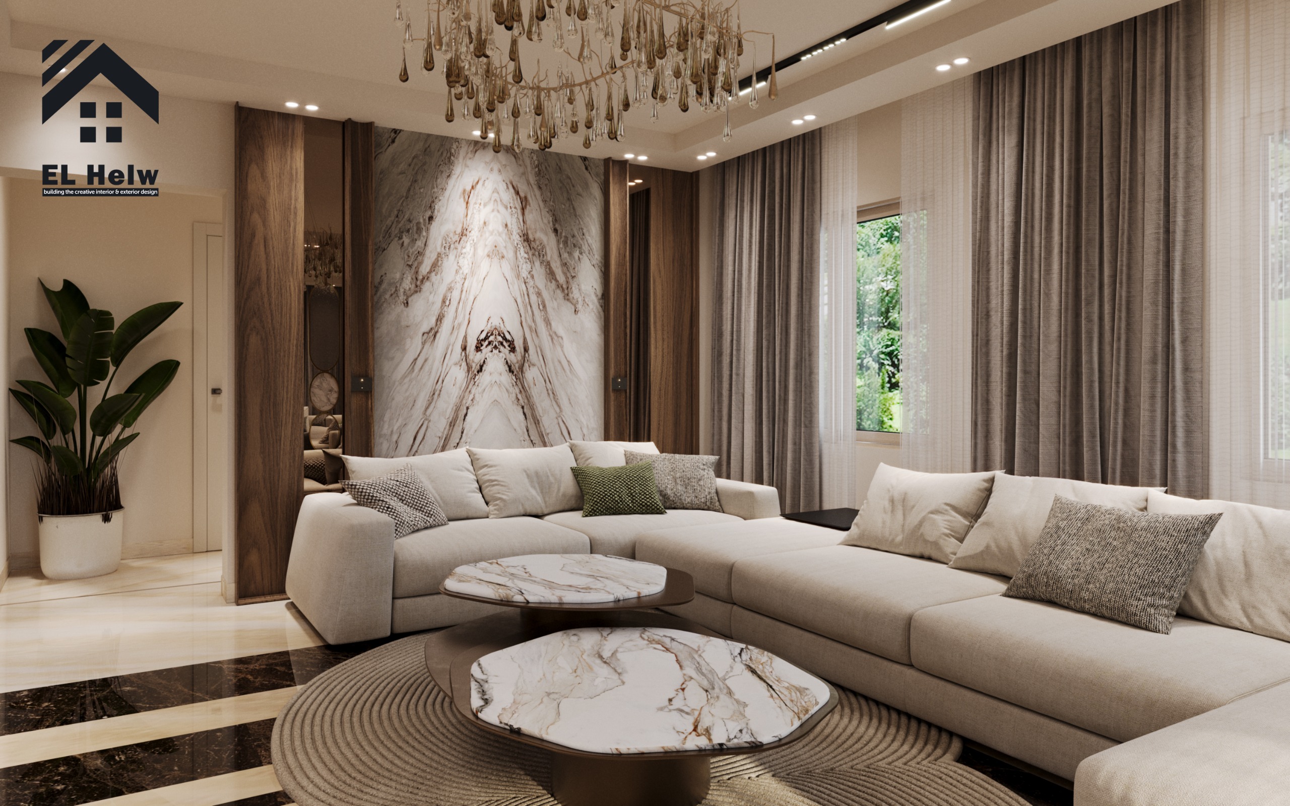
A luxury living room in a villa featuring earthy color tones, indirect natural lighting, and execution by Al-Helou Finishing.
Comparison Table: How Al-Helou Designs Chooses Color Schemes Based on Space Nature
| Architectural Space | Sun & Facade Direction | Engineering Orientation & Color Scheme | Visual & Psychological Result (Office Perspective) |
| Reception Spaces | Open & variable (combining north and south) | 60-30-10 rule using deep neutral tones (beige, warm grey). | Reflects luxury and prestige without clutter, interacting flexibly with hidden lighting and chandeliers. |
| Living Rooms | Facing west (intense afternoon sun) | Calm, earthy color tones that absorb severe heat and direct light. | Gives the eye a sense of spaciousness and tranquility, relieving daytime visual fatigue. |
| Master Bedrooms | Oriented away from direct sunset heat | Soft colors derived from nature (serene blue, sage green, sandy tones). | Achieves maximum biological relaxation and visual noise isolation to ensure sleep quality. |
| Kitchens & Workrooms | Facing east or north (cool morning light) | Neutral, luminous shades with neutral white lighting (4000K). | Enhances feelings of cleanliness, vitality, activity, and facilitates focus and attention. |
The Bedroom Color Scheme: An Oasis of Calm and Rest
In master bedrooms and children's rooms, our color perspective changes entirely. The goal here is not to impress the visitor, but to achieve the highest levels of biological and psychological relaxation. We completely steer away from loud or strongly contrasting colors, opting instead for:
-
Soft colors derived from nature, such as serene blue.
-
Sage green tinged with grey.
-
Warm, eye-soothing sandy gradients.
We also orient master bedrooms away from direct sunset heat, utilizing paints with acoustic and thermal insulation properties that enhance sleep quality and visual comfort day and night.
The Role of Natural and Artificial Lighting in Highlighting the Color Scheme
Color can never be separated from light in any luxury finishing project. We meticulously study the color temperature (Kelvin) of each space:
-
Warm Lighting (2700K - 3000K): Highlights earthy and golden tones, imparting luxury to sitting rooms and receptions.
-
Natural or Neutral White Lighting (4000K): Blends smoothly with grey and white tones in kitchens and workrooms.
We plan the distribution of hidden lighting units and spotlights right from the structural design phase, ensuring a seamless integration that gives our clients' villas a unique character pulsing with life and quiet luxury. You can browse our portfolio in interior and exterior finishes to see the practical application of these standards.
Common Mistakes in Villa Color Selection.. And How "Al-Helou" Experts Fix Them!
From our extensive experience in executing and finishing luxury villas and mansions, we notice certain recurring mistakes made during color decisions. At "Al-Helou Architectural Designs," we don't just spot the mistake; we provide the engineering and technical solutions to correct it:
-
Absolute Reliance on "Paint Catalogs" Without Real-World Testing
-
The Mistake: Choosing wall colors based on a small sample at the showroom or on a phone screen, only for the owner to discover after painting the entire wall that the color looks jarringly bright or dark due to interaction with the space's actual lighting.
-
Al-Helou's Solution: We create mock-ups directly on the actual space walls in areas of at least one square meter, observing how the color interacts with natural and artificial lighting at different times of the day before approving the final paint.
-
-
Ignoring Space Size and Ceiling Height (The Dark Box Effect)
-
The Mistake: Choosing very dark shades or "trendy colors" in rooms or hallways with limited spaces and insufficient heights, creating a suffocating and cramped feeling.
-
Al-Helou's Solution: We skillfully employ the architectural Color Flow; we utilize dark tones exclusively in spacious areas with high ceilings to add luxury and warmth, while adopting reflective, luminous shades for ceilings and confined spaces to trick the eye and create a sense of expansive horizons.
-
-
Overlooking Existing Furniture and Flooring
-
The Mistake: Choosing wall paint colors in isolation from wooden flooring (parquet), marble, or bulky furniture colors, resulting in annoying visual clashes and an uncoordinated appearance.
-
Al-Helou's Solution: We build the color scheme according to the Comprehensive Visual Integration Rule, ensuring color balance between flooring, walls, and furniture through intermediate neutral grades that tie elements together seamlessly.
-
-
Uniform Lighting Color Temperature Across All Spaces
-
The Mistake: Using the same type of white or yellow lighting in every room of the villa, ruining the chosen wall colors and causing eye strain (such as using cold white lighting in bedrooms or very warm lighting in workrooms and kitchens).
-
Al-Helou's Solution: We precisely determine lighting color temperatures (Kelvin) for each architectural space in advance coordination with the color scheme, ensuring wall beauty is highlighted and the psychological function of the space is served.
-
💡 Golden Advice from "Al-Helou" Experts:
Never choose paint and finishing colors based on what you see in ready-made pictures or someone else's house; colors interact live and directly with your home's unique architecture. Always remember that a successful color is one that serves the space's function and reflects your own identity, not what a fleeting trend dictates. Always consult a specialized interior designer to merge your personal taste with well-researched engineering standards.
Frequently Asked Questions (FAQ)
Q: How do we begin choosing the color scheme for a new villa?
A: We start by studying the villa's location, sun and wind directions, and the nature of each architectural space, then develop an integrated color palette that merges the owner's desires with the engineering standards of luxury and spaciousness.
Q: Does the villa's area affect the choice of interior colors?
A: Yes, spacious areas can handle dark and deep tones to add warmth and luxury, while limited spaces rely on bright, luminous shades to enhance the sense of openness.
Q: How do we ensure color harmony between the ground and first floors of the villa?
A: We design a guiding color thread (Color Flow) linking the villa's spaces as a whole, with studied shade variations in private spaces like bedrooms to serve their unique functions.
Are You Looking to Design and Finish Your Dream Villa with Unique Engineering Standards?
Let us help you turn your ideas and vision into a tangible reality pulsing with luxury and comfort. Our team at "Al-Helou Architectural Designs & Finishing" is ready to provide integrated engineering consultation and design the most suitable color and architectural scheme for your villa.
📞 Contact us today or book your free engineering consultation:
-
Direct WhatsApp: Start your instant chat with us on WhatsApp
Image gallery